Showing posts with label portrait. Show all posts
Friday, July 5, 2013
Pretty Poisons Series Complete!
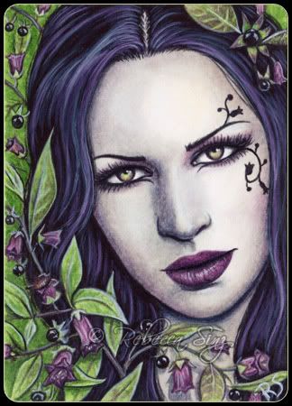
Here are the final two pretty Poisons in the series!! "Oleander" and "Aconitum" which is also known as wolfsbane, monkshood and the queen of poisons. I hope you all have enjoyed this series!! Prints off all of these can be found on my website, ebay store, etsy... the usual. :)
Labels:
aceo,
fantasy art,
flowers,
gothic,
paintings,
poisonous flowers,
portrait,
prints,
series,
watercolor
Tuesday, June 18, 2013
False Hellebore
"False Hellebore" -- Pretty Poisons #6
Here is the sixth one! Just two more to go now! I hope you like her! I liked the idea of doing green flowers. I'm trying to vary the colors of these as much as possible, though there will be two pink flowers in the series but they are very different shades. :) I'd also like to note that False Hellebores (aka Veratrum album, Veratrum Virde, Corn Lily) are a completely different species of flower than Black Hellebores (Helleborus niger) that I did as #1 in this series. Both are toxic. They have similar names, but aren't related at all.
Watercolor and white gouache. ACEO (2.5 x 3.5")
The original is for auction HERE!
Prints are available on my website.
Here is the sixth one! Just two more to go now! I hope you like her! I liked the idea of doing green flowers. I'm trying to vary the colors of these as much as possible, though there will be two pink flowers in the series but they are very different shades. :) I'd also like to note that False Hellebores (aka Veratrum album, Veratrum Virde, Corn Lily) are a completely different species of flower than Black Hellebores (Helleborus niger) that I did as #1 in this series. Both are toxic. They have similar names, but aren't related at all.
Watercolor and white gouache. ACEO (2.5 x 3.5")
The original is for auction HERE!
Prints are available on my website.
Labels:
aceo,
aceo painting,
auction,
ebay,
face,
false hellebore,
gothic,
green,
green flowers,
original art,
plant,
poison,
poisonous,
portrait,
toxic,
watercolor
Sunday, March 24, 2013
Wisdom -- New Art!
Wisdom
I finally finished this painting!! It was a long time in coming. Last month I came down with the flu, which had me sick for 2 weeks. And then when I was starting to feel better from that I caught something else! lol Now I am finally feeling better and have this painting to share with you! :)
I started this back in November, but other work and then illness got in the way of my finishing it until now. I'm so happy with how this turned out, and I love the owls even though I thought I'd go crazy working on the feather details! I very much hope you like her too!
8.5 x 11" Watercolor and white gouache.
Prints of her are now available on my website HERE.
And lastly, I have some new stamps out from Sweet Pea Stamps! These are available as Rubber Stamps and Digi Stamps.
You can see those here: Rubber | DIGI
I finally finished this painting!! It was a long time in coming. Last month I came down with the flu, which had me sick for 2 weeks. And then when I was starting to feel better from that I caught something else! lol Now I am finally feeling better and have this painting to share with you! :)
I started this back in November, but other work and then illness got in the way of my finishing it until now. I'm so happy with how this turned out, and I love the owls even though I thought I'd go crazy working on the feather details! I very much hope you like her too!
8.5 x 11" Watercolor and white gouache.
Prints of her are now available on my website HERE.
I also have some new bookmark designs available!
These are available HERE.
You can see those here: Rubber | DIGI
Labels:
art,
barn owl,
bookmarks,
fantasy art,
great horned owl,
owls,
painting,
portrait,
rubber stamps,
shaman,
snowy owl,
stamps,
watercolor,
woman
Saturday, September 15, 2012
Dead Sea - New Art!
"Dead Sea"
Here is my newest painting! This is a commissioned painting. I was given free reign with a photo the client gave me. I love commissions like this! Since I've been on a mermaid kick lately, here is another! :) I believe this will be my last mermaid for a little while though.
5 x 7" watercolor and white gouache.
Prints are available on my website, eBay and Etsy!
I discovered something simple but neat while working on this painting. I discovered that there is indeed a difference between using zinc white gouache and titanium/permanent white. A while back I'd done some reading about gouache painting because I was thinking and still hope to do some all-gouache paintings someday. I'd read that zinc white isn't as opaque as titanium white, but it is good for making tints. When I first began combining white gouache with my watercolor, I mainly used it to add some white highlights here and there, so for that I wanted the most opaque white. Over the years my techniques have changed some. I paint in watercolors in transparent and opaque techniques. I know the traditional watercolor approach is to use watercolor and let the white of the paper show through. For the most part I do paint that way, but I do like to use other techniques such as bodycolor, which is the use of opaque watercolor (either all-gouache or by mixing opaque white with transparent watercolor). I usually do this by mixing a little of a color (watercolor) with white gouache. I was never a stickler for tradition and am more concerned with the final result.
I've been using this technique with titanium/permanent white for several years now, since that was the white I had. While at Michaels last week I saw a tube of zinc white and remembered what I'd read about it being good for making tints. Since that is basically what I've been doing I bought the tube and tested it out on this painting. I have to say that I love this white so much better for my technique of painting! It is a more sheer white, but this works so great for building up subtle layers! And it can become very opaque when desired. I only used zinc white for the gouache parts of this painting, which includes much of the skeleton fish, the bright highlights and detailing in her hair and scales. It seems like it blends better with the watercolor and looks more natural and less chalky. I've always wondered whether it would really make a difference... now I know. :) I'm sure there will still be times when the opaqueness of titanium white will be better suited, but I'm glad that I made this discovery about zinc white for my bodycolor techniques!
I hope everyone has a great weekend! :)
Here is my newest painting! This is a commissioned painting. I was given free reign with a photo the client gave me. I love commissions like this! Since I've been on a mermaid kick lately, here is another! :) I believe this will be my last mermaid for a little while though.
5 x 7" watercolor and white gouache.
Prints are available on my website, eBay and Etsy!
I discovered something simple but neat while working on this painting. I discovered that there is indeed a difference between using zinc white gouache and titanium/permanent white. A while back I'd done some reading about gouache painting because I was thinking and still hope to do some all-gouache paintings someday. I'd read that zinc white isn't as opaque as titanium white, but it is good for making tints. When I first began combining white gouache with my watercolor, I mainly used it to add some white highlights here and there, so for that I wanted the most opaque white. Over the years my techniques have changed some. I paint in watercolors in transparent and opaque techniques. I know the traditional watercolor approach is to use watercolor and let the white of the paper show through. For the most part I do paint that way, but I do like to use other techniques such as bodycolor, which is the use of opaque watercolor (either all-gouache or by mixing opaque white with transparent watercolor). I usually do this by mixing a little of a color (watercolor) with white gouache. I was never a stickler for tradition and am more concerned with the final result.
I've been using this technique with titanium/permanent white for several years now, since that was the white I had. While at Michaels last week I saw a tube of zinc white and remembered what I'd read about it being good for making tints. Since that is basically what I've been doing I bought the tube and tested it out on this painting. I have to say that I love this white so much better for my technique of painting! It is a more sheer white, but this works so great for building up subtle layers! And it can become very opaque when desired. I only used zinc white for the gouache parts of this painting, which includes much of the skeleton fish, the bright highlights and detailing in her hair and scales. It seems like it blends better with the watercolor and looks more natural and less chalky. I've always wondered whether it would really make a difference... now I know. :) I'm sure there will still be times when the opaqueness of titanium white will be better suited, but I'm glad that I made this discovery about zinc white for my bodycolor techniques!
I hope everyone has a great weekend! :)
Labels:
bodycolor,
dark,
fantasy art,
gothic,
gouache,
horror,
mermaid,
painting techniques,
portrait,
sea,
skeleton fish,
skulls,
titanium white,
undersea,
watercolor,
zinc white
Sunday, August 5, 2012
New ACEOs!!
"Mina"
This first ACEO was a commission that I finished at the end of July. I mean I finished it on the very last day of the month, so it counts as a July painting, just barely! ;)
I wasn't going to do any commissions for a little while but I am sometimes willing to take on ACEO commissions even when my commissions are closed just because they're so quick and fun to do. This one was particularly fun since I pretty much got to do whatever I like with it. A freedom that I enjoyed! :)
I named her "Mina" since she reminds me of the character from Dracula.
Watercolor and white gouache. 2.5 x 3.5" Prints are available on my website.
"Bleeding Hearts"
Next is my newest Pretty Poison ACEO! This is number four in the series. I wanted her to different from other pink flowers that I've done and I think I managed to pull it off. I like her pink and white hair! :) I hope you like her too!
Watercolor and white gouache. 2.5 x 3.5"
The ORIGINAL ACEO is for auction on ebay right now! View the auction HERE
Prints are available on my website.
This first ACEO was a commission that I finished at the end of July. I mean I finished it on the very last day of the month, so it counts as a July painting, just barely! ;)
I wasn't going to do any commissions for a little while but I am sometimes willing to take on ACEO commissions even when my commissions are closed just because they're so quick and fun to do. This one was particularly fun since I pretty much got to do whatever I like with it. A freedom that I enjoyed! :)
I named her "Mina" since she reminds me of the character from Dracula.
Watercolor and white gouache. 2.5 x 3.5" Prints are available on my website.
"Bleeding Hearts"
Next is my newest Pretty Poison ACEO! This is number four in the series. I wanted her to different from other pink flowers that I've done and I think I managed to pull it off. I like her pink and white hair! :) I hope you like her too!
Watercolor and white gouache. 2.5 x 3.5"
The ORIGINAL ACEO is for auction on ebay right now! View the auction HERE
Prints are available on my website.
Labels:
aceo,
art,
bleeding hearts,
fantasy art,
gothic,
painting,
pink,
poison,
poisonous flowers,
portrait,
watercolor
Wednesday, June 20, 2012
Deadly Nightshade
"Deadly Nightshade"
Here she is! #3 in my Pretty Poisons series!
I hope you like her!
ACEO (2.5 x 3.5") watercolor and white gouache.
The original is now up on eBay! View the auction HERE
Prints are also available on my website. They can be found HERE
Here she is! #3 in my Pretty Poisons series!
I hope you like her!
ACEO (2.5 x 3.5") watercolor and white gouache.
The original is now up on eBay! View the auction HERE
Prints are also available on my website. They can be found HERE
Labels:
aceo,
art,
belladonna,
deadly nightshade,
ebay auction,
fantasy art,
flowers,
gothic,
painting,
plants,
poisonous flowers,
portrait,
prints,
watercolor
Thursday, May 10, 2012
Hemlock -- Pretty Poisons #2
"Hemlock"
#2 in my ACEO Pretty Poisons Series!
Here she is; the second in the series. I liked working in mostly green and white! I don't think I've done this combination before... hmm wait, my "Wild Vines" fairy kind of was... but she wasn't this vibrant! ;)
The original is currently for auction HERE!!
Prints of her are also available on my website!
The auction for the original "Black Hellebore" ACEO is still running too! It has about 4 days left. Visit and bid HERE!
I'm going to have to take a small break from doing this series, first to do the prize ACEO for my giveaway I had last week! This one will be gothic and very fun for me! I'm starting to sketch it tonight. :) After that, I have a commission that I believe I will have to start. But I might be able to squeeze in Pretty Poison #3 in between... not sure. It's setting up to be a pretty busy month! :)
In other news, "Steampunk Assassin" has just been released as a cross stitch pattern on Heaven and Earth Designs! Check her out HERE.
#2 in my ACEO Pretty Poisons Series!
Here she is; the second in the series. I liked working in mostly green and white! I don't think I've done this combination before... hmm wait, my "Wild Vines" fairy kind of was... but she wasn't this vibrant! ;)
The original is currently for auction HERE!!
Prints of her are also available on my website!
The auction for the original "Black Hellebore" ACEO is still running too! It has about 4 days left. Visit and bid HERE!
I'm going to have to take a small break from doing this series, first to do the prize ACEO for my giveaway I had last week! This one will be gothic and very fun for me! I'm starting to sketch it tonight. :) After that, I have a commission that I believe I will have to start. But I might be able to squeeze in Pretty Poison #3 in between... not sure. It's setting up to be a pretty busy month! :)
In other news, "Steampunk Assassin" has just been released as a cross stitch pattern on Heaven and Earth Designs! Check her out HERE.
Labels:
aceo,
fantasy art,
flowers,
green,
hemlock,
painting,
portrait,
watercolor,
white
Monday, May 7, 2012
New ACEO and Giveaway Winner!
"Black Hellebore"
This is the first of a new ACEO series call "Pretty Poisons!" There will be 6-8 of these. I have them all planned already, I'm just not sure about one or two of them yet. So there will be at least 6. :)
This one features the black hellebore, as one of my pretty poisonous flowers. I believe that these flowers are naturally white or pink, but I saw a black variety and thought that they inspired a much more interesting painting.
The ORIGINAL ACEO is now for Auction HERE!
Prints are also available on my website HERE
And without further ado, the winner of my custom ACEO giveaway is... Sao V!! Congratulations to you! The winner has been contacted by email.
Thank you to all who entered my giveaway! I hope to have another one sometime! :)
This is the first of a new ACEO series call "Pretty Poisons!" There will be 6-8 of these. I have them all planned already, I'm just not sure about one or two of them yet. So there will be at least 6. :)
This one features the black hellebore, as one of my pretty poisonous flowers. I believe that these flowers are naturally white or pink, but I saw a black variety and thought that they inspired a much more interesting painting.
The ORIGINAL ACEO is now for Auction HERE!
Prints are also available on my website HERE
And without further ado, the winner of my custom ACEO giveaway is... Sao V!! Congratulations to you! The winner has been contacted by email.
Thank you to all who entered my giveaway! I hope to have another one sometime! :)
Labels:
aceo,
black hellebore,
ebay auction,
fantasy art,
flowers,
painting,
poisonous flowers,
portrait,
watercolor
Tuesday, April 24, 2012
Steampunk Assassin WIP
I showed this sketch in my last post and mentioned possibly showing some of the progress, so I'm starting a new post all about this painting. I will be updating this post as the painting progresses so check back if you want to see it's progress.
So far, I've pretty much done background work. I just started the skin earlier today, and plan on doing more tonight. I haven't gotten far enough with that to show pics yet, so back to the background work.
My first step is to transfer the sketch to the watercolor paper. I do this using graphite paper and tracing over the sketch. Once that is done, I tape it down to a board with masking tape. Next is my ALL time favorite step (being very sarcastic here), applying masking fluid to the foreground parts that I don't want painted yet. I really hate using masking fluid. I used to completely avoid it but over the last few years I've come to realize that it is a necessary evil because my backgrounds turn out so much better when I can just paint carelessly over the foreground. I think in one of my old tutorials, I even mention how I use it as little as possible. But methods do change over time. The yellow tool you see in the picture next to the masking fluid bottle is what I use to apply it. It's a cheap plastic sculpting tool I got at Michael's a while ago when I was trying out polymer clay, which I had no talent with so didn't pursue for very long. lol But it works great for MF and it peels right off it afterwards, so no more ruined brushes!
I next start painting the background. I've decided to paint it as a rusty, riveted steel wall. I've found that since I got my Kindle Fire around Christmas, that it is really handy for looking up reference pictures while painting! I don't have to waste time and paper printing them out and this takes up very little room propped up in the corner of my table. :)
Now, I have the background basically finished. Once everything else is done, I may think it needs something else done to it, but for now it seems done. Next is my second favorite part (more sarcasm here), removing the masking fluid. I don't always have to use quite as much masking fluid as I did in this painting, but this is a 8.5 x 11" painting and she takes up most of the paper! So it took a while just to get all this off. I use and eraser and just lift it off.
![]() |
| Fun!..............NOT |
Eventually she is masking fluid free! But a lot of the lines lightened with the removal of the MF. Not as bad as the picture looks, but still quite faded.
So I went over the lines with a light blue/gray paint, and also cleaned up around the outside of the figure where the MF bled outside of the lines.
Now that she is cleaned up, I'm ready to continue onto the skin. I'll add more pics and progress once I get there. ;)
-----------------------------------------------------------------------------------------
4/26/12:
So, moving onto the skin now, I began by filling in all the skin with a flesh-toned mixture of burnt-sienna/burnt umber. In the second two pictures shown above, I'm am adding some shading and shadows with various mixtures of burnt sienna/ultramarine blue. And in some of the darkest areas I used payne's gray, to bring in a little of the background colors.
I wrote a tutorial/walk-through for my painting "Fairy of the Spring Bloom," which can be read HERE. This tutorial is from 2008, but I still work in much the same way. Especially for skin tones. I paint almost exclusively on hot press watercolor paper now, which is completely smooth and much easier to get little details on and also use with colored pencils. Sometimes I don't use colored pencils at all in a painting. But I think that with all the details and the size of this painting, that I probably will in her clothing and hair. Colored pencils add some different textures to a painting too, which will be nice with the different materials in this painting.
The colors for the skin tones do vary depending on the colors being used in the painting, though I usually do start off with the basic burnt sienna/burnt umber flesh tone. Colors for the shadows and highlights are what change. This painting and my 2008 fairy painting just happen to both use bt. sienna/BU, and ultramarine. But the ultramarine can be swapped for greens or purples, depending on the painting. For example, my painting "Lilac" used more purple tones in the shading, and "Woodland Magic" used green tones.
The pictures below show the same basic process shown above only with the face, which I give a lot of attention to since I feel that it is one of the most important parts of a painting, if not THE most important part.
After the shading is done (at least for now), comes a very important part of the skin tones. As of right now, the skin is kind of cold, dull and lifeless. If you look skin tones, they usually have some red/pink tones to it and some yellows. Adding these colors to the skin really breaths some life into it. For my older fairy painting I used alizarin crimson for the red tone because it is a more cooler, pink leaning red. That made sense for that painting since she was surrounded by pink cherry blossoms. It worked to bring some of that pink into her skin.
But the color scheme for this painting is much different. A lot more neutral tones will be used in this painting. Perylene Maroon is a color that I most often use. It is a nice deep reddish-brown. It seems to work great for skin tones! I used that for this painting and some Yellow Ochre for the yellow tones.
I was concentrating pretty hard while working on the face, so I didn't take many progress photos. Sorry about that! I saw some little anatomy type issues while painting that I worked to fix as much as I could. Like making sure the eyes are level and sized right. Eyes are so easy for me to have one a little off, so I really try to make sure they are as right as possible. I narrowed her chin out a little and also her mouth by like a millimeter. It's so small you probably won't notice.
Despite all that, the face is one of my favorite parts! I love working on the makeup and watch as she comes together on paper.
I'm fairly sure that the face will need some more shadows, particularly near her forehead, but I think that I will move on to her clothes now and then come back to that. It is often easier to tell if the skin needs any more work once the clothes and hair are filled in.
-----------------------------------------------------------------------------------------
4/27/12:
Now, I've started on the clothing. I began first by filling in most of the base colors. This also included filling in behind the lacy part of the fan lightly with the colors that will be seen through it. I think that I'm still going to have to darken the part of her dress that is behind the fan.
In the second picture, I've colored the brown leather of her corset, gloves and choker with colored pencils. Next time I work on this, I have to finish the gold buckles and fasteners and detail the teal insert of her corset... Then onto the fan! :)
Now, I've started on the clothing. I began first by filling in most of the base colors. This also included filling in behind the lacy part of the fan lightly with the colors that will be seen through it. I think that I'm still going to have to darken the part of her dress that is behind the fan.
In the second picture, I've colored the brown leather of her corset, gloves and choker with colored pencils. Next time I work on this, I have to finish the gold buckles and fasteners and detail the teal insert of her corset... Then onto the fan! :)
-----------------------------------------------------------------------------------------
4/29/12:
This time, I started with the gold/brass buckles and details. I shaded and highlighted them making them look more shiny and real. I also filled in the teal panels of her corset with colored pencil so that the coloring is smoother and now I can add the pattern back into the fabric.
Using colored pencils again, I drew the pattern back onto the fabric.
Now I can finally move onto the fan!
I began by filling in the main colors of the fan... the gears and the lacy interior. I was originally going to make the gears silver or steel gray coloring, but I decided that the fan would be much more striking if it was brass/gold too. The lace of the interior section is going to be black so I filled that in with a transparent layer of paint, and painted the gears a golden color.
I used ink to draw in the frame (?) of the fan. I'm not sure that's what it's called but that's what I'll call it. ;) I used ink because after filling the area in with paint, I couldn't see the lines anymore, so I basically had to redraw them. This was a lot easier to do with a ruler and ink pen than with paint and brush. And faster too. I also found later that this was nice for darken the area further. I didn't have to worry about the lines disappearing.
After darkening the panel with another layer of paint, I drew in the lace detailing. I also used an ink pen for this and it was so much easier and faster! I'm glad that I thought to do it that way this time. I have used paint for things like this in the past and it does take quite a bit more time.
I got a bit carried away while working on the rest of the fan, and I didn't take any more pictures until I was done. I detailed and defined the gears of the fan, and added the little bit of blood along the edge. I also added a little highlighting to the frame of the fan.
Next I can move onto the hair and hat. Then probably some finishing touches and she should be done! So when I update this next it should be with the final stages of the painting and the finished product. :)
This time, I started with the gold/brass buckles and details. I shaded and highlighted them making them look more shiny and real. I also filled in the teal panels of her corset with colored pencil so that the coloring is smoother and now I can add the pattern back into the fabric.
Using colored pencils again, I drew the pattern back onto the fabric.
Now I can finally move onto the fan!
I began by filling in the main colors of the fan... the gears and the lacy interior. I was originally going to make the gears silver or steel gray coloring, but I decided that the fan would be much more striking if it was brass/gold too. The lace of the interior section is going to be black so I filled that in with a transparent layer of paint, and painted the gears a golden color.
I used ink to draw in the frame (?) of the fan. I'm not sure that's what it's called but that's what I'll call it. ;) I used ink because after filling the area in with paint, I couldn't see the lines anymore, so I basically had to redraw them. This was a lot easier to do with a ruler and ink pen than with paint and brush. And faster too. I also found later that this was nice for darken the area further. I didn't have to worry about the lines disappearing.
After darkening the panel with another layer of paint, I drew in the lace detailing. I also used an ink pen for this and it was so much easier and faster! I'm glad that I thought to do it that way this time. I have used paint for things like this in the past and it does take quite a bit more time.
I got a bit carried away while working on the rest of the fan, and I didn't take any more pictures until I was done. I detailed and defined the gears of the fan, and added the little bit of blood along the edge. I also added a little highlighting to the frame of the fan.
Next I can move onto the hair and hat. Then probably some finishing touches and she should be done! So when I update this next it should be with the final stages of the painting and the finished product. :)
-----------------------------------------------------------------------------------------
*NEW* 4/30/12:
I begin the hair by outlining around the edges with a small paint brush. I also outlined the hat since I intend to work on this at the same time. Before filling in the hair with paint, I added the details to the angel wing charm.
Next, I fill in all the hair and hat with dark brown paint. I let that dry completely.
Then I detail the hair and hat with colored pencil. I used several different shades of brown colored pencils for this and and a light tan color for her blonde streaks. I use Prismacolor pencils, so I used dark brown, dark umber, sienna brown and I did some dark shading with indigo and a little black. The highlights were done in ginger root and light umber and some shine added with white.
I used the same browns to color the hat.
I didn't take anymore photos, but I used black painting to fill in a transparent wash for the veil of the hat, and I added some detailing with white colored pencil. Then I painted the larger feather of her hat a teal color to match her eyes and corset.
Having all her hair done, I decided that her face need a little more shading added, so I went back and darkened around her forehead and the right side of her face. With all that done, I then believe that she is finished!
I begin the hair by outlining around the edges with a small paint brush. I also outlined the hat since I intend to work on this at the same time. Before filling in the hair with paint, I added the details to the angel wing charm.
Next, I fill in all the hair and hat with dark brown paint. I let that dry completely.
Then I detail the hair and hat with colored pencil. I used several different shades of brown colored pencils for this and and a light tan color for her blonde streaks. I use Prismacolor pencils, so I used dark brown, dark umber, sienna brown and I did some dark shading with indigo and a little black. The highlights were done in ginger root and light umber and some shine added with white.
I used the same browns to color the hat.
I didn't take anymore photos, but I used black painting to fill in a transparent wash for the veil of the hat, and I added some detailing with white colored pencil. Then I painted the larger feather of her hat a teal color to match her eyes and corset.
Having all her hair done, I decided that her face need a little more shading added, so I went back and darkened around her forehead and the right side of her face. With all that done, I then believe that she is finished!
Details:
I hope that you enjoyed seeing this painting come together!! Prints of her are now available on my website HERE
Labels:
fantasy art,
painting,
portrait,
steampunk,
tutorial,
victorian,
walk-through,
watercolor,
wip
Subscribe to:
Posts (Atom)